01 Project Overview
Sit & Eat is an app that makes it easy for users (tourists, locals, etc.) to find a restaurant near their location, make a reservation and request food so that when you get to the restaurant the kitchen starts up so as not to waste a lot of time. This application has a list of restaurants in all the cities of the world with photographs of the place, food and drink. You can also find the menu and reviews of different diners who have been to them.
- Project Duration:
- January 2021 to May 2021
The Problem
Busy workers and travelers lack time to prepare food at home or wait long for a meal at the restaurant.
My Role
UX designer designing an app for Sit&Eat from conception to delivery.
The Goal
Design a Sit&Eat app that allows user to make a restaurant reservation and / or easily pick up or eat dishes of all types of food.
Responsabilities
Conducting interviews, paper and digital wireframing, low-fidelity and high-fidelity prototyping, usability studies, accessibility accounting, and design iteration.
02 Project Summary
I conducted interviews and created empathy maps to understand the users that I am design for and your needs. A core user group identified through research. They were working adults and had no time to cook. This group of users confirmed initial assumptions about Sit&Eat customers, but the investigation. It also revealed that time was not the only factor limiting users to cooking at home. Other problems of the users included obligations, trips, interests of knowing other cultures through gastronomy or challenges that they do. It's hard to get food or a restaurant when you're out of town.
PAIN POINTS
Time
Working adults are too busy to spend time on meal prep.
Confidence
Tourists like to find satisfying food and price restaurants near them when they travel.
Accessibility
The platforms for making a reservation and ordering food are not equipped with assistive technologies.
IA
Restaurant web pages are often difficult to read.
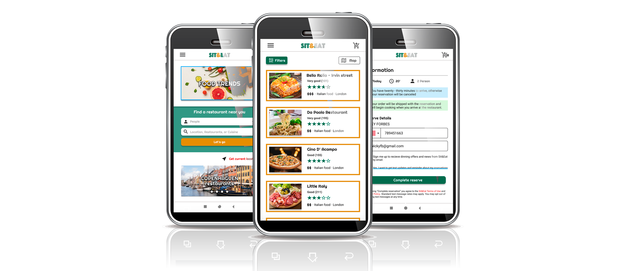
03 Digital Wireframes
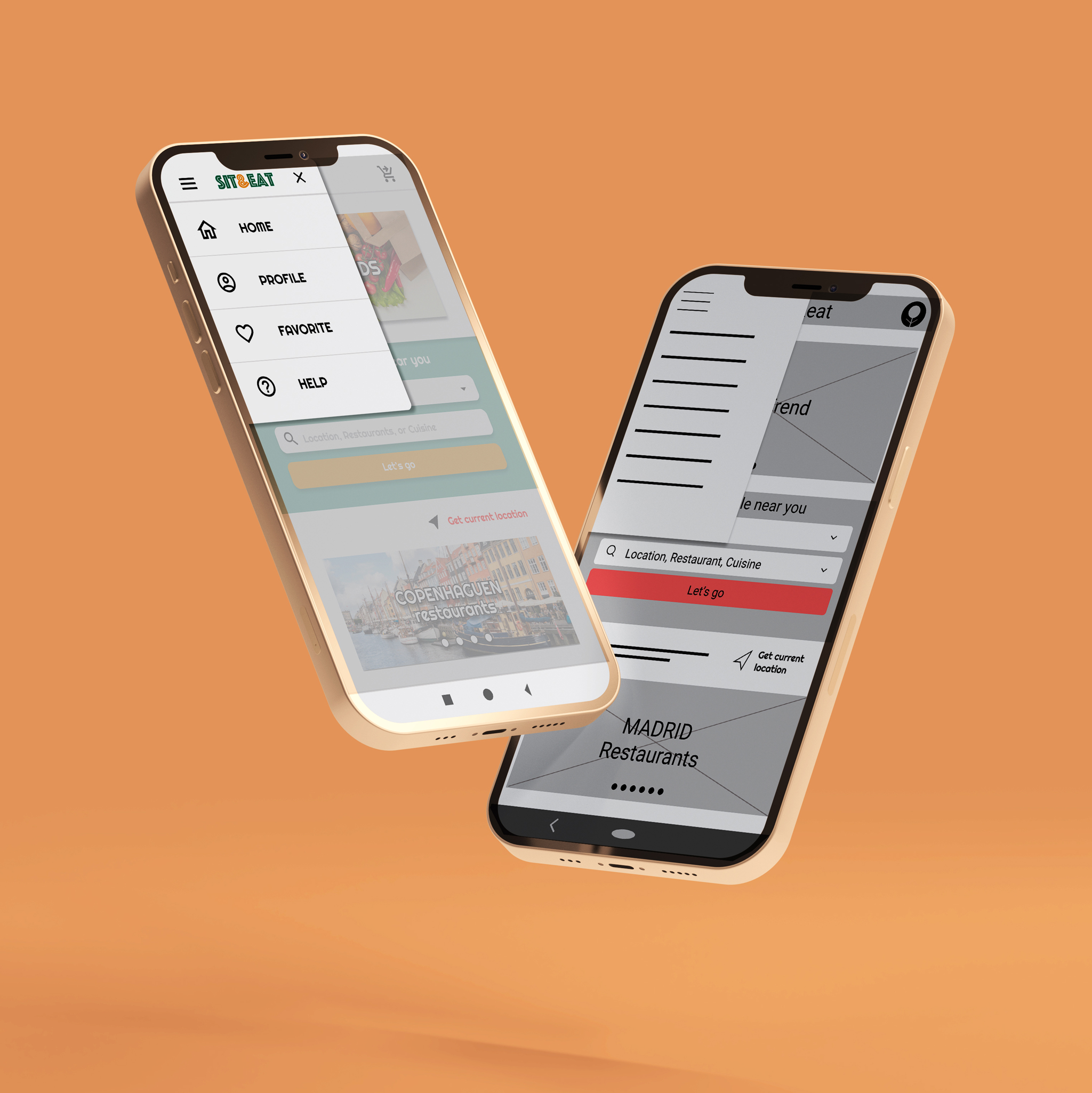
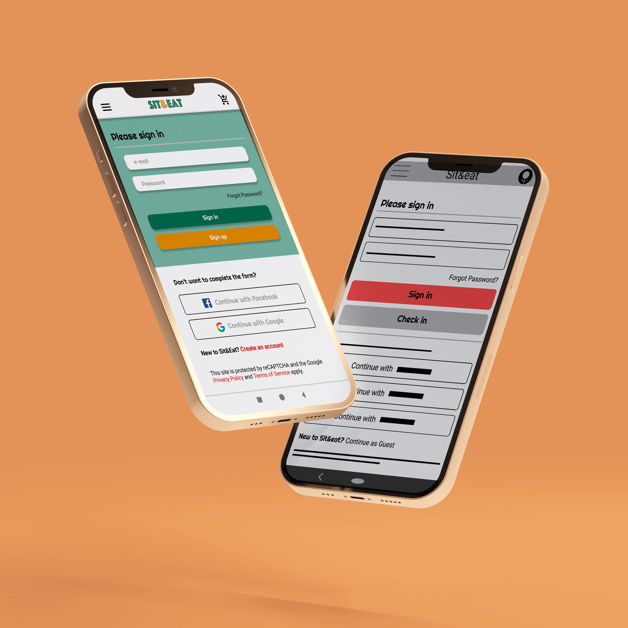
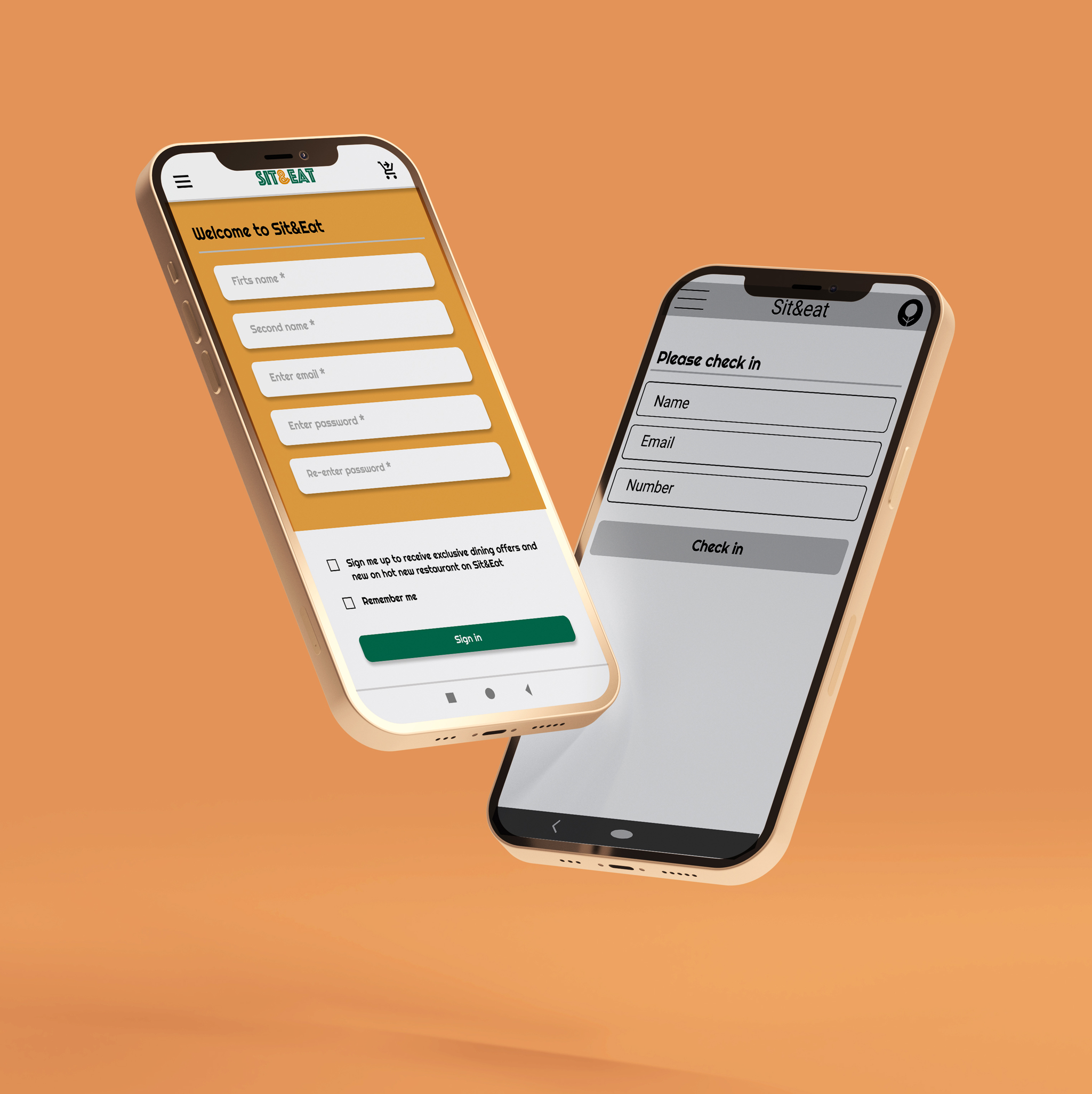
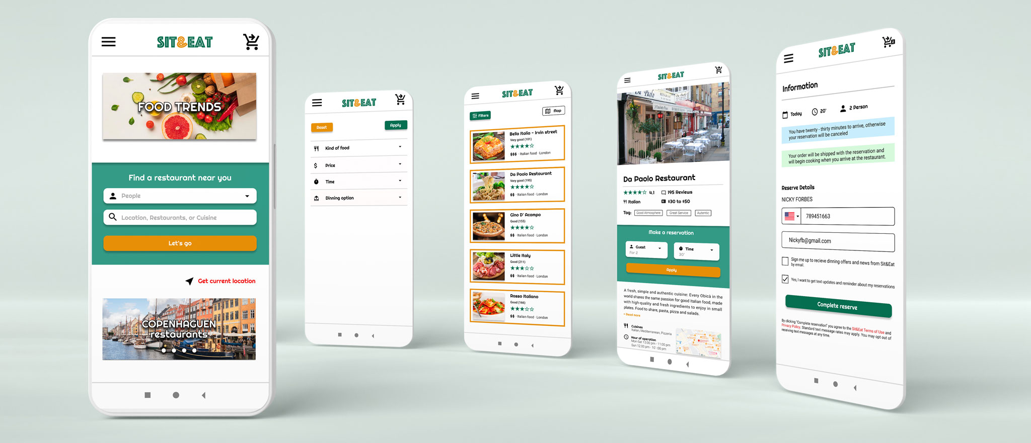
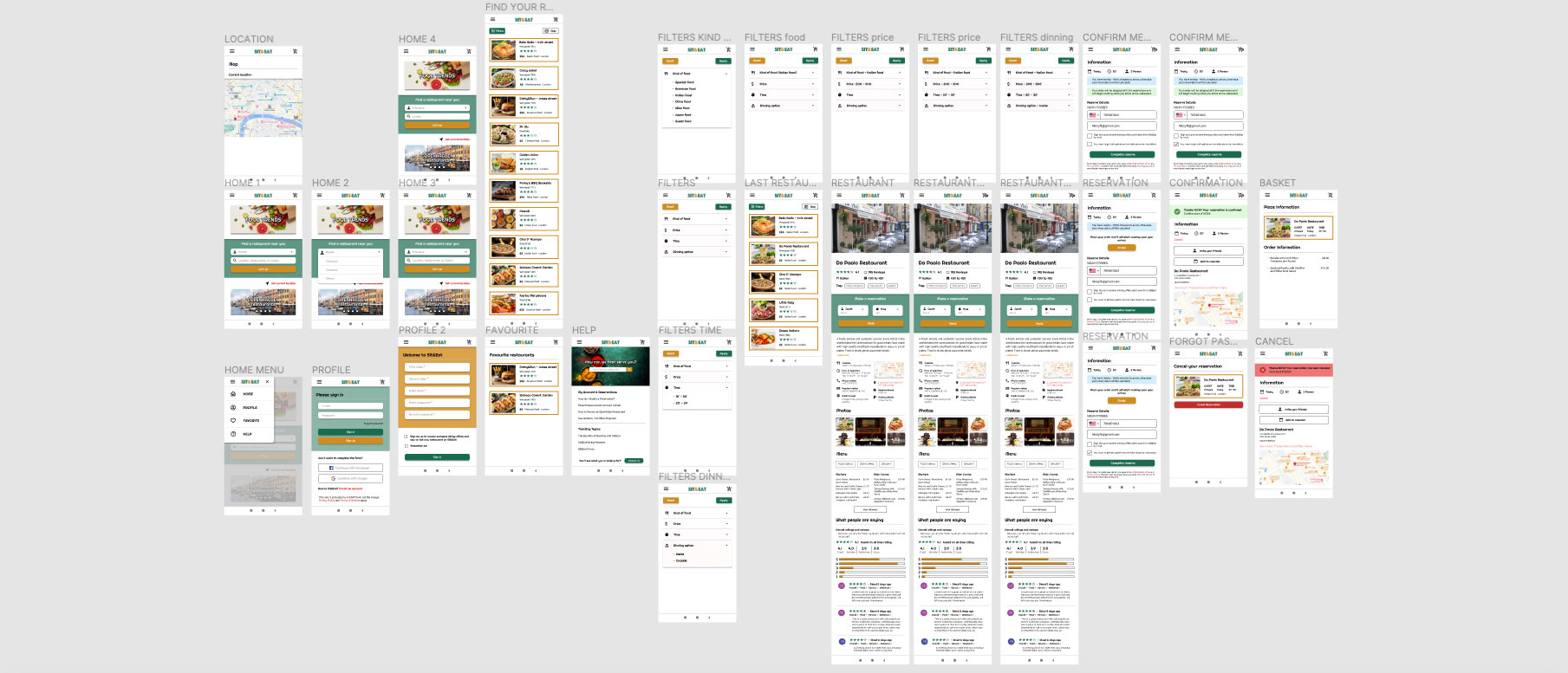
As the initial design phase continued, I made sure to base screen designs on feedback and findings from the user research. Easy navigation was a key user need to address in the designs in addition to equipping the app to work with assistive technologies. More specific easy navigation was a key user need to address in the designs, as well as equipping the application to work with assistive technologies.As the design phase continued, based on user feedback and research results. Hence the need to add the order to the reservation due to the short waiting time of users in the restaurant. Also adding a basket button to provide the reservation information.
The first designs allowed some customization, but after usability studies i added additional options like favorites and help section. I also revised the layout so that users see all the options in the menu when they first land on the screen. The second usability study revealed frustration with the flow of booking conditions. To streamline this flow, I added the basket button and an 'Order Summary' screen.
USABILITY STUDY: FINDINGS
Round 1 Findings
Round 2 Findings
04 High Fidelity Prototype
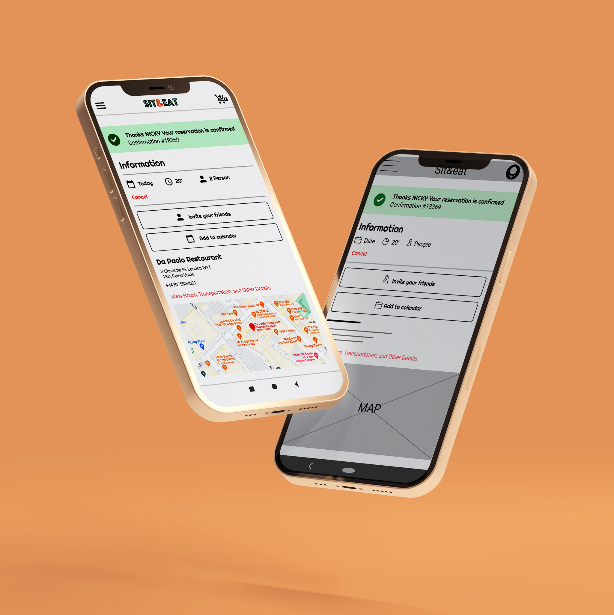
The final hi-fi prototype featured cleaner streams of users for booking and ordering. It also met the needs of the user by having the option of the order summary to obtain the information of the reservation made.
ACCESSIBILITY CONSIDERATIONS
1
Provided access to users who are vision impaired through adding alt text to images for screen readers.
2
Used icons to help make navigation easier.
3
Used detailed images of restaurants place, food and drink for help all users better understanding The designs.
Takeaway
Impact
Impact: The application makes users feel that Sit&Eat really thinks about how to meet their needs.
A quote from peer comments: 'The app made my summer vacation in Spain so easy and fun for lunch and dinner! Finally I was able to enjoy Mediterranean food. I would definitely use this app as an option for a delicious, quick, and even healthy meal'.
What I learned
While designing the Sit&Eat application, I learned that the first ideas for the application are only the beginning of the process. Usability studies and peer feedback influenced each iteration of the app designs.